Fall 2020
Using Infographics to Convey Research Findings
Becca Krukowski, PhD✉ and Carly M. Goldstein, PhD✉; Civic and Public Engagement Committee

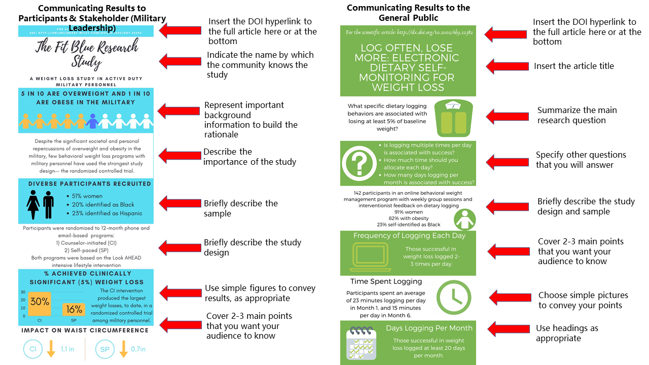
Infographics are an effective tool for science communication and dissemination. Blending text and graphics, infographics can help you communicate scientific findings to the public, other scientists, and patient communities. Since they are easier to read and require less prerequisite scientific knowledge to understand than a research paper, they can increase access to scientific findings. If you are considering creating and sharing an infographic summarizing some of your recent work, consider these do’s and don’ts as you get started:
Do: Find a design tool that works for you. Ideally, a design tool would have templates to inspire your creativity, simple pictures to use, and tools to help you precisely align the components in your infographic. We personally use the free version of Canva.
Don’t: Try to fit your whole research article into an infographic. The essential points to cover are conveying the research question and 2-3 most important results (specific to what your audience cares about). Aim for 150 words or fewer.
Do: Consider your audience. Infographics can be used to convey information to research participants, politicians, other stakeholders, the general public, or scientific audiences. Tailor your infographic to the audience. One paper may warrant multiple infographics communicating different information to different groups.
Don’t: Be intimidated by infographics. With the help of a design tool, an infographic can be drafted in an hour or two. You will then want to get feedback on the infographic from your scientific colleagues and also friends and relatives who are not as familiar with your research.
Do: Make your infographic pleasing to the eyes. Choose colors carefully to make sure that your infographic will be easily readable and that the colors work together well.
Don’t: Follow these guidelines 100%. These guidelines will hopefully help you get started with making infographics by revealing some “formulas” that can be used. But as long as your infographic is clearly communicating your research to your intended audience, you are doing it correctly!
Do: Distribute your infographic widely. While most journals do not (yet!) encourage or support submitting an infographic alongside your scientific article, sharing your infographic on social media is a great way to disseminate your research to multiple audiences. Consider what hashtags you may want to use on social media or consider sending your infographic directly to patient-facing organizations that can send it to their membership.
Next time you publish a paper, consider creating an accompanying infographic targeting communication with lay audiences to increase the public health impact of your work. When you share an infographic on Twitter, tag @BehavioralMed, and let the SBM community amplify your efforts!